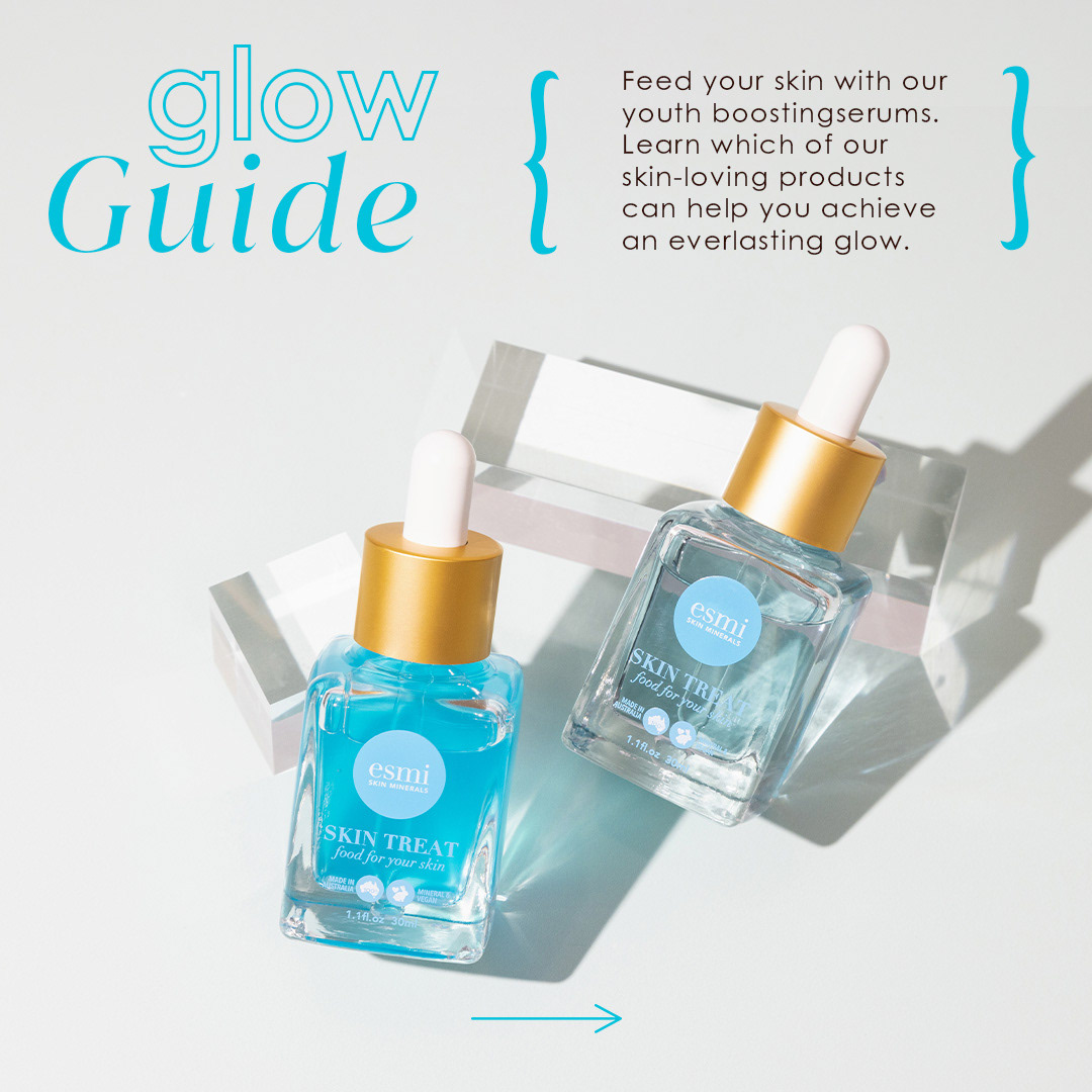

What’s better than a skincare showdown? A skincare showdown with swatches, leafy bits, and font play. This was a timed trial to design a carousel for Instagram comparing Retinol and Bakuchiol — two heavy-hitters in the world of glow-ups — with the brief asking for something more than just product photos and text slapped on top (music to my design-loving ears).
My approach?
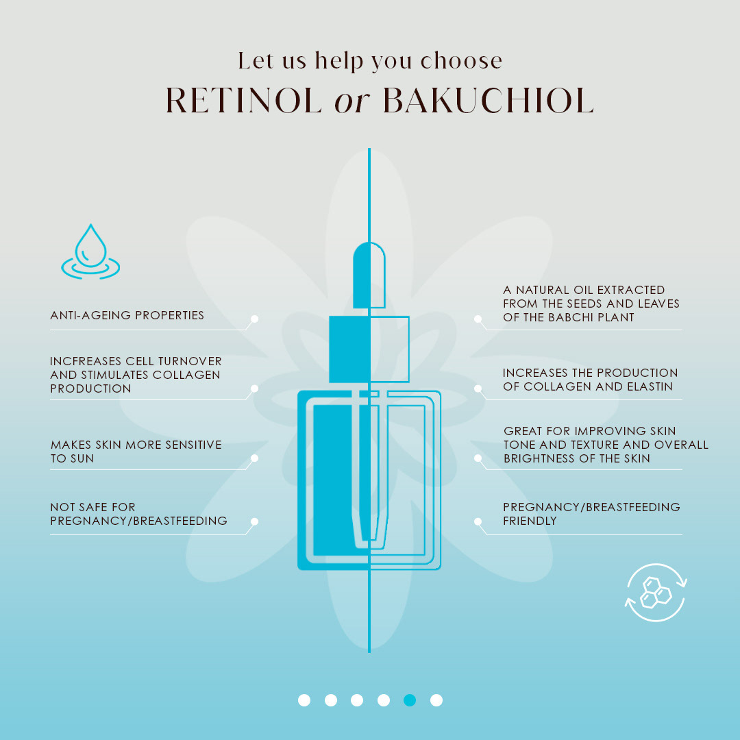
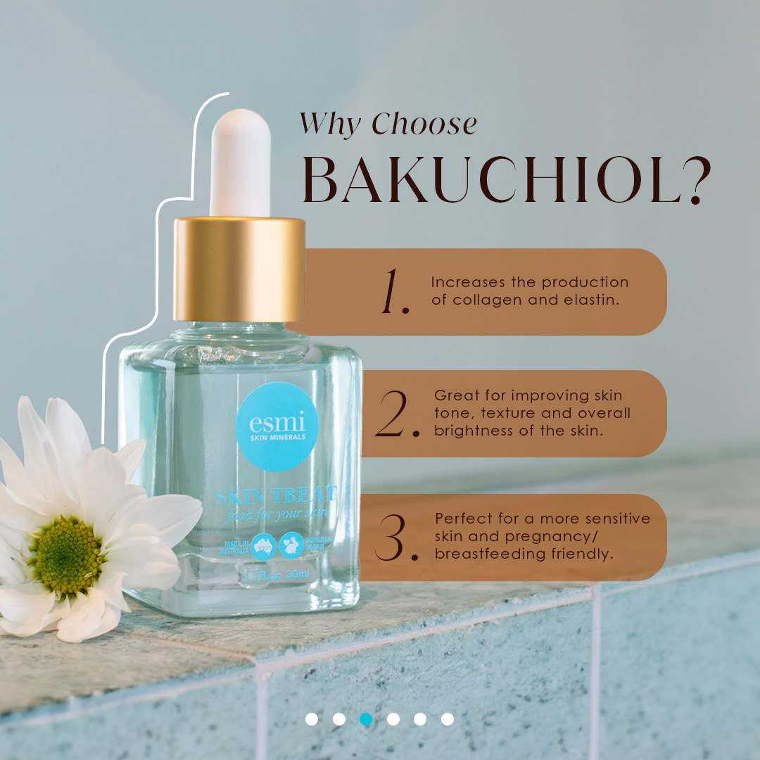
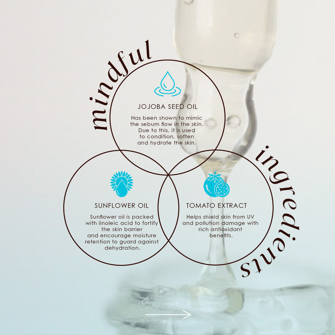
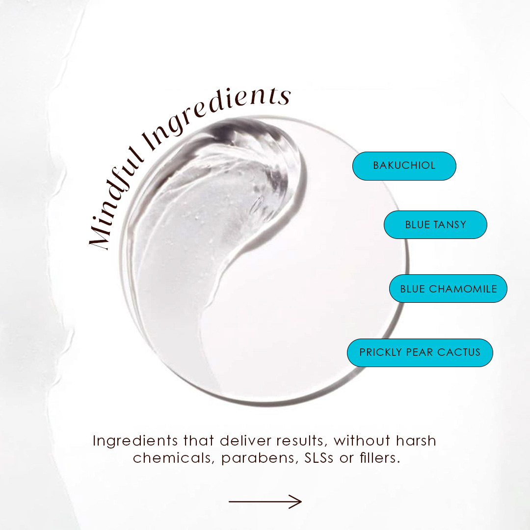
I leaned into the brand’s earthy, botanical vibe, building a visual identity for each ingredient using vector icons (think babchi leaves, oil drops, little petri-dish textures). Typography was where the fun really started. I used bolds, italics, outlines and regulars to subtly guide the viewer through the info without it ever feeling like homework.
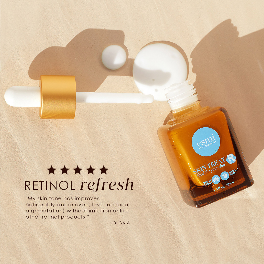
The layout followed a clean grid (hello, structure), but I kept things feeling warm and editorial through colour swatches inspired by nature and skincare itself. I brought in real 5-star review quotes too, to root the whole piece in experience, not just science.
What it shows:
I can design on the clock without losing attention to detail
I’m not afraid to get playful with type and layout
I know how to stay on-brand without playing it safe
I can turn an ingredients list into something you actually want to swipe through
Bonus points:
Everything you see was designed from scratch in under 2 hours, without a single Canva template in sight.