The Campaign
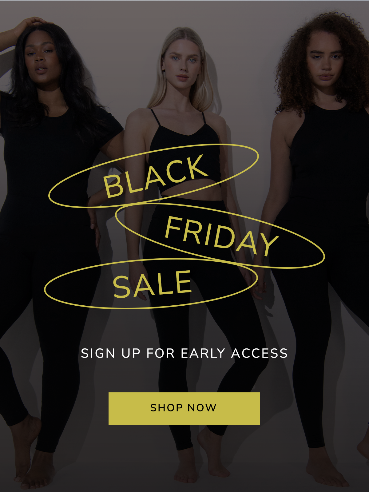
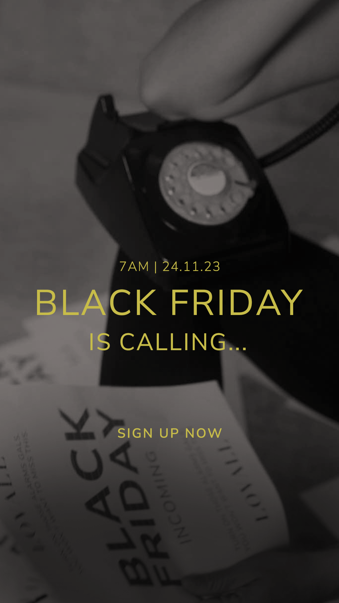
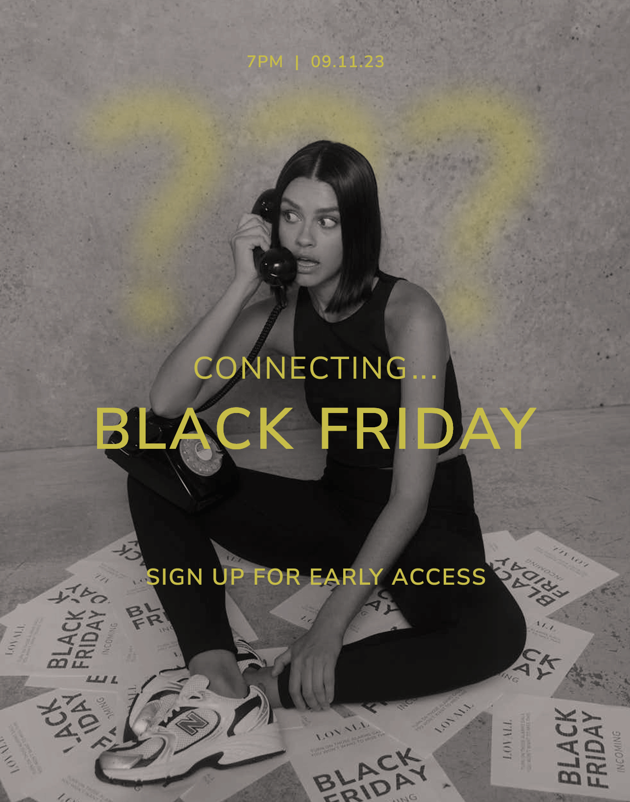
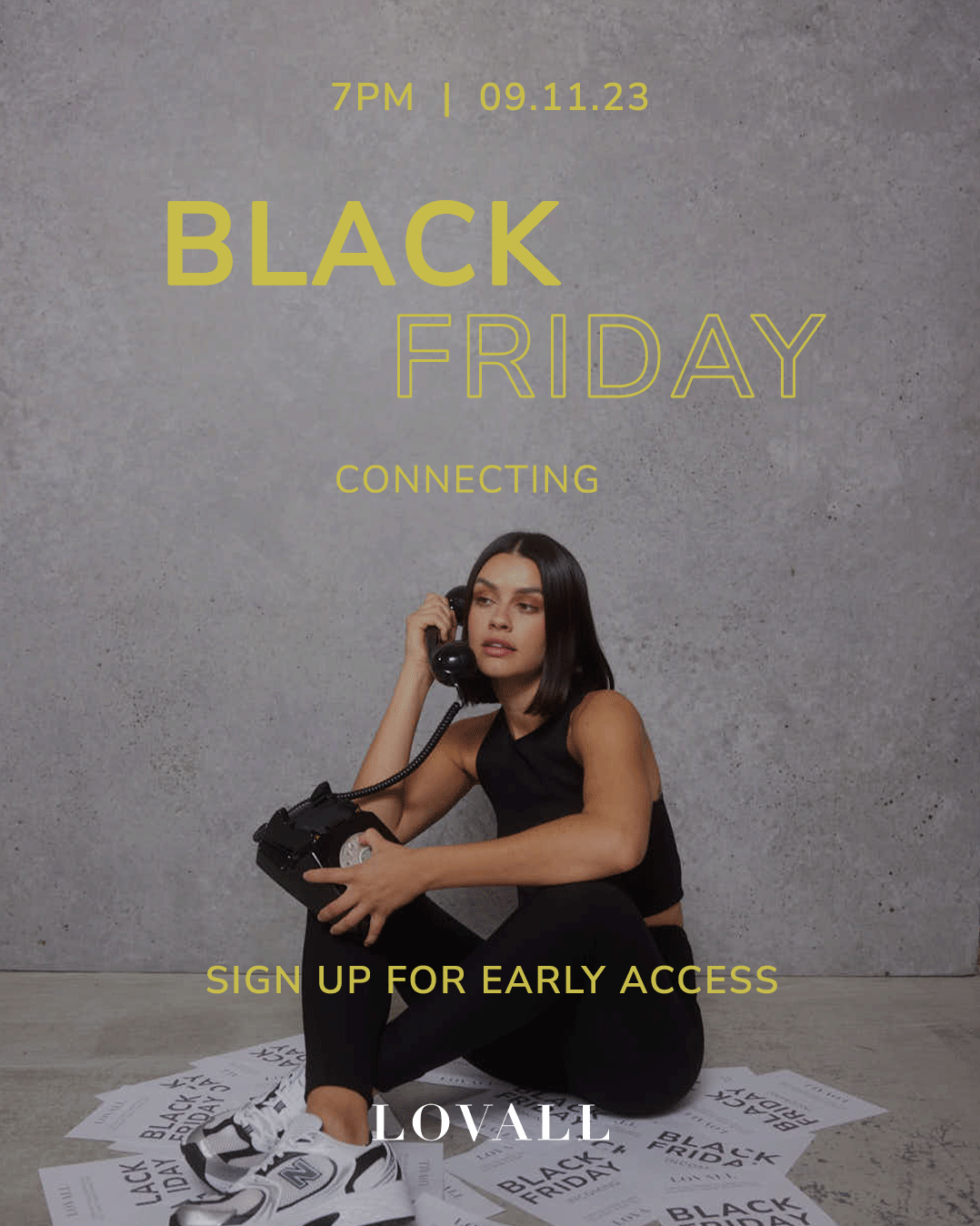
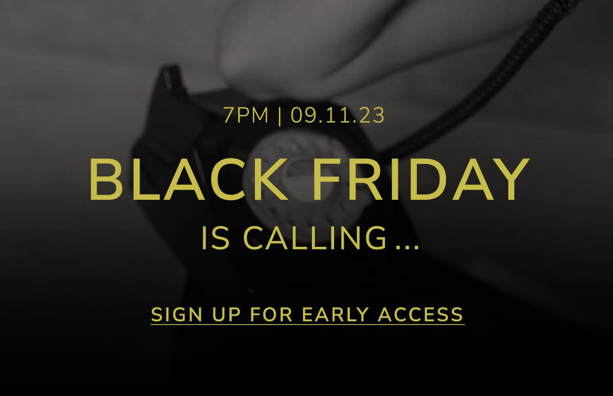
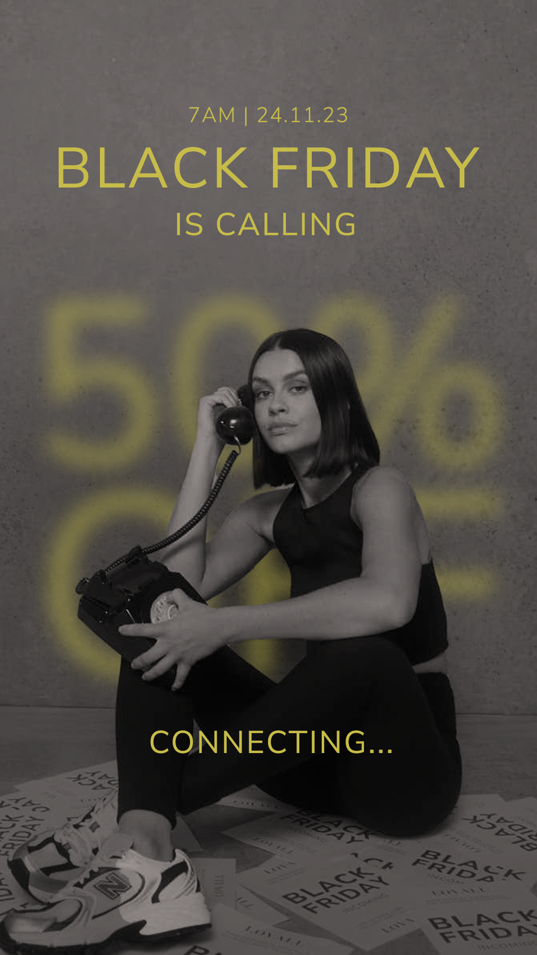
We kicked things off with a teaser: “Black Friday is calling.”
No prices. No percentages. Just intrigue.
No prices. No percentages. Just intrigue.
We aimed to build anticipation without giving the game away too soon. By keeping the discount under wraps, we leaned into curiosity and created a sense of exclusivity, encouraging our audience to watch this space. The teaser phase wasn’t about urgency yet; it was about warming up the audience, priming inboxes and feeds for what was to come.
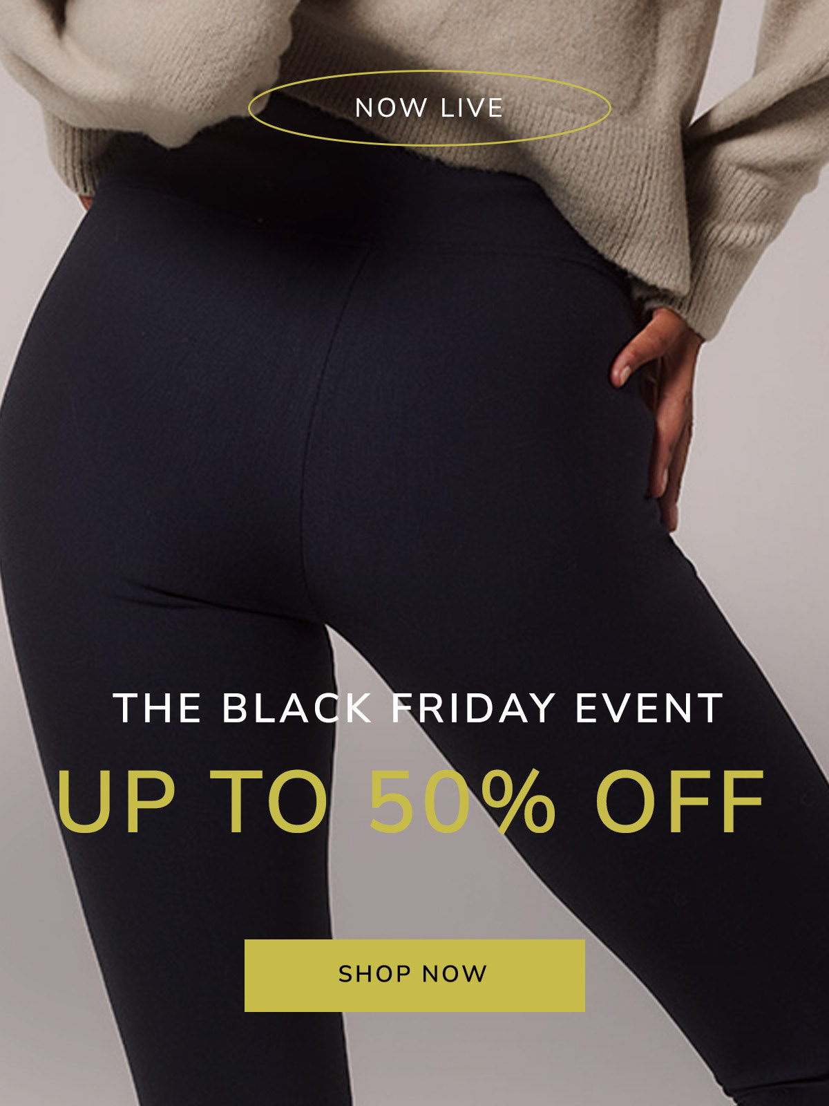
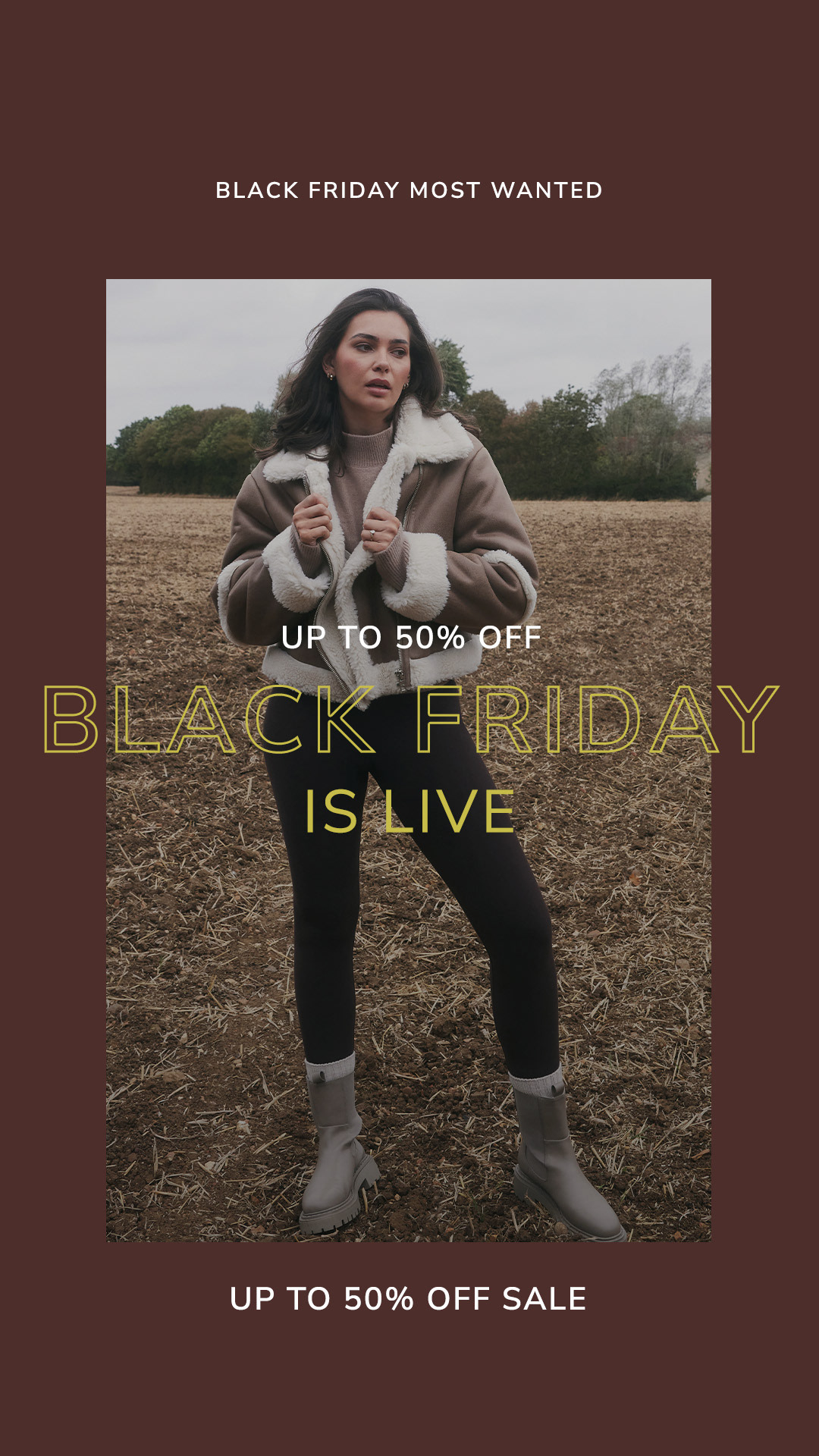
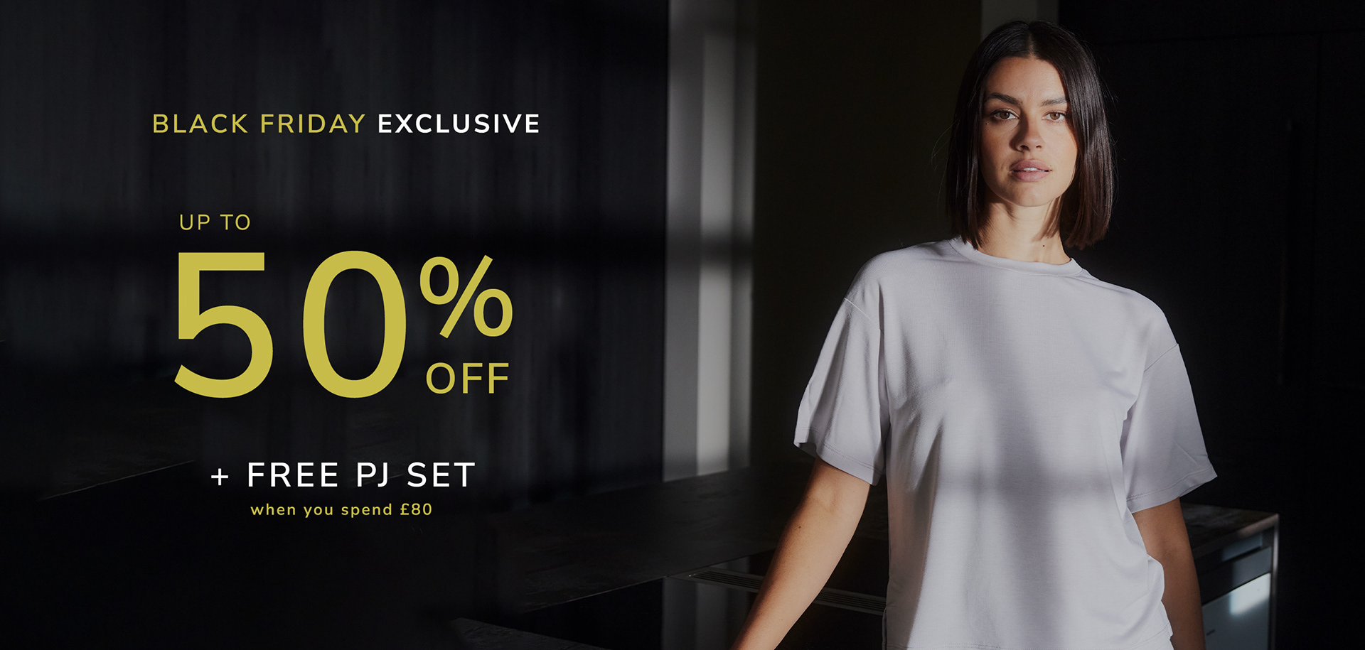
Then came the early access pre-sale. A VIP moment for those already tuned in. This phase rewarded our most engaged customers with first dibs before the full-sale chaos hit—nurturing loyalty, driving conversions early, and helping spread the word organically.
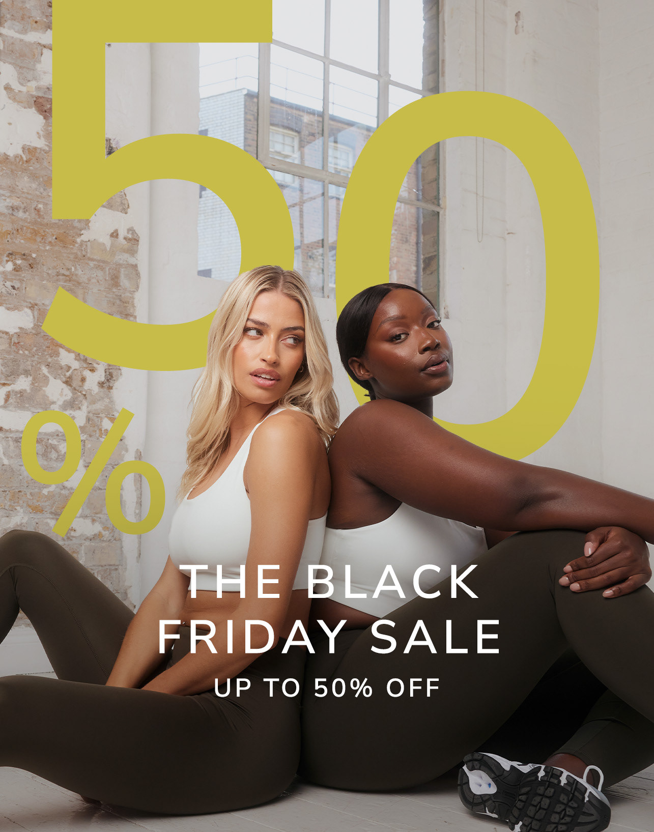
Together, the campaign unfolded like a story: from quiet suspense to full-blown sale fever: strategic, intentional, and designed to disrupt. It was a moment where we dialled up the drama, loosened the brand seams just enough to make noise, and met the chaos of Black Friday with energy that cut through.
Truthfully, from concept to completion, the Black Friday campaign for LOVALL was mere weeks in the making. As I'm sure we are all aware, budget restraints, time-crunches, and resources meant that we couldn’t roll out a bespoke shoot just for the sale. So we did what scrappy, creative teams do best—we got clever. We piggybacked off existing e-comm shoots, pulling models aside mid-shot to squeeze in moments that became the bones of our teaser campaign. From there, it was all about making it feel intentional, tying the teaser to the main sale campaign through smart design choices, consistent visuals, and a little post-production wizardry to make sure everything looked cohesive, recognisable, and anything but rushed. I led the whole journey: shaping the creative direction, producing assets across digital channels, and making sure every touchpoint felt cohesive, compelling, and unmistakably LOVALL.
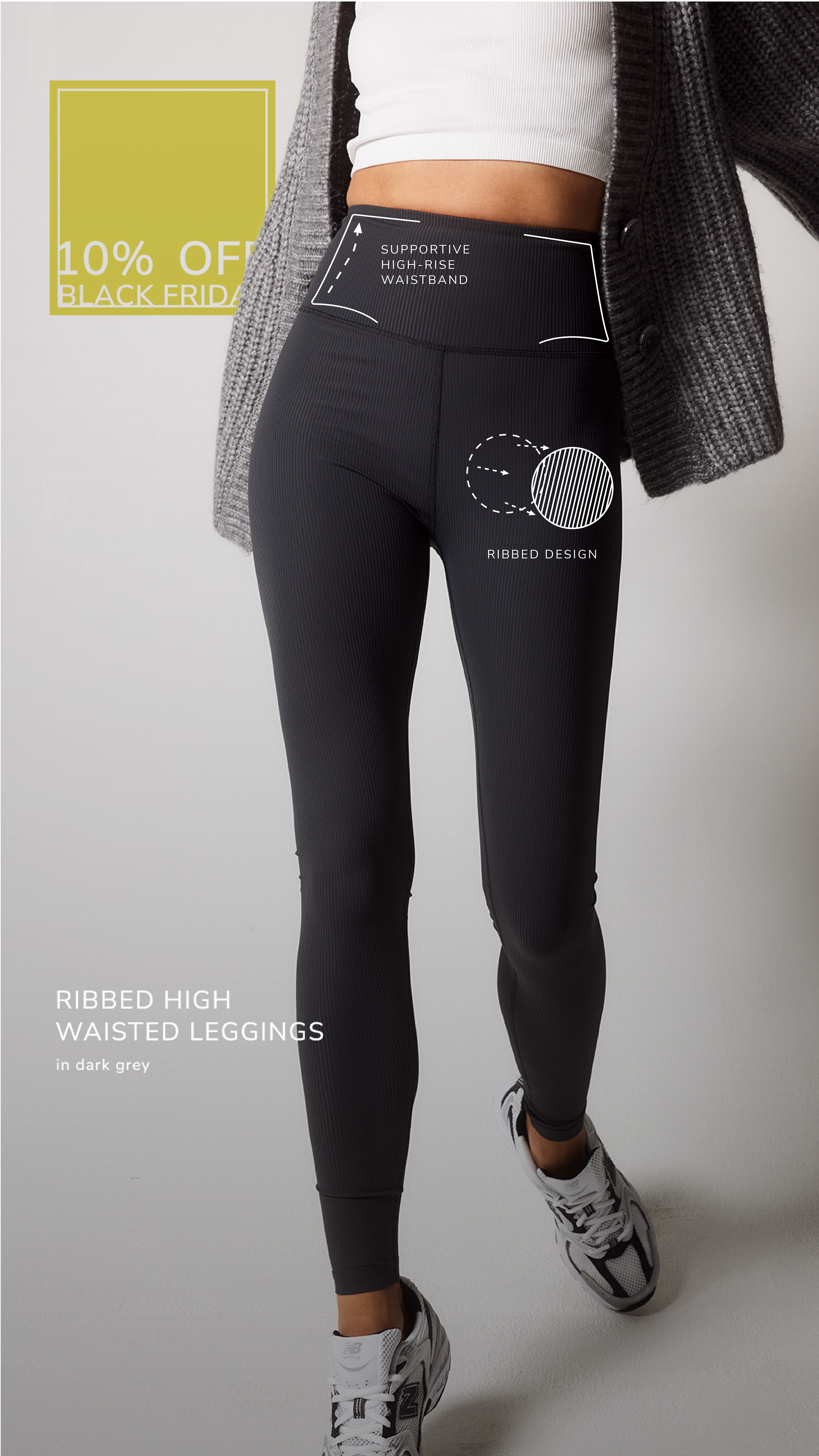
In the e-comm world, USPs aren’t a nice-to-have; they’re everything. As a leggings brand speaking to Gen Z, we knew we had to go beyond just looking good and prove exactly why LOVALL was worth their click.
We approached our product like a real estate listing—showcasing every feature that made our leggings a cut above the rest: the fit, the fabric, the function. Think of it as a tour through the blueprint of better leggings.
To bring it all to life, we layered in illustrated animated elements, adding a playful, tactile edge that drove home the concept and stood out in a sea of same-same static ads. The result? A campaign that was equal parts informative and scroll-stopping, rooted in hard evidence but delivered with heart.
See below ⬇
Motion Graphic Content
During the early stages we tested various ideas and concepts that aimed to create a campaign that would cut through the Black Friday noise and draw the consumer in.
Ultimately, we didn’t move forward with the design direction below. It featured space hopper elements that highlighted key messaging, and the concept was grounded in purpose. When approaching the sale graphics, I was focused on creating something that could break through the visual noise of a crowded promotional period. The bouncing, animated elements were designed as scroll-stoppers, playful yet intentional, drawing the eye toward the most important messaging. It wasn’t just about the content itself, but how motion and unexpected design choices could help elevate visibility and engagement during a time when every brand is striving for attention.
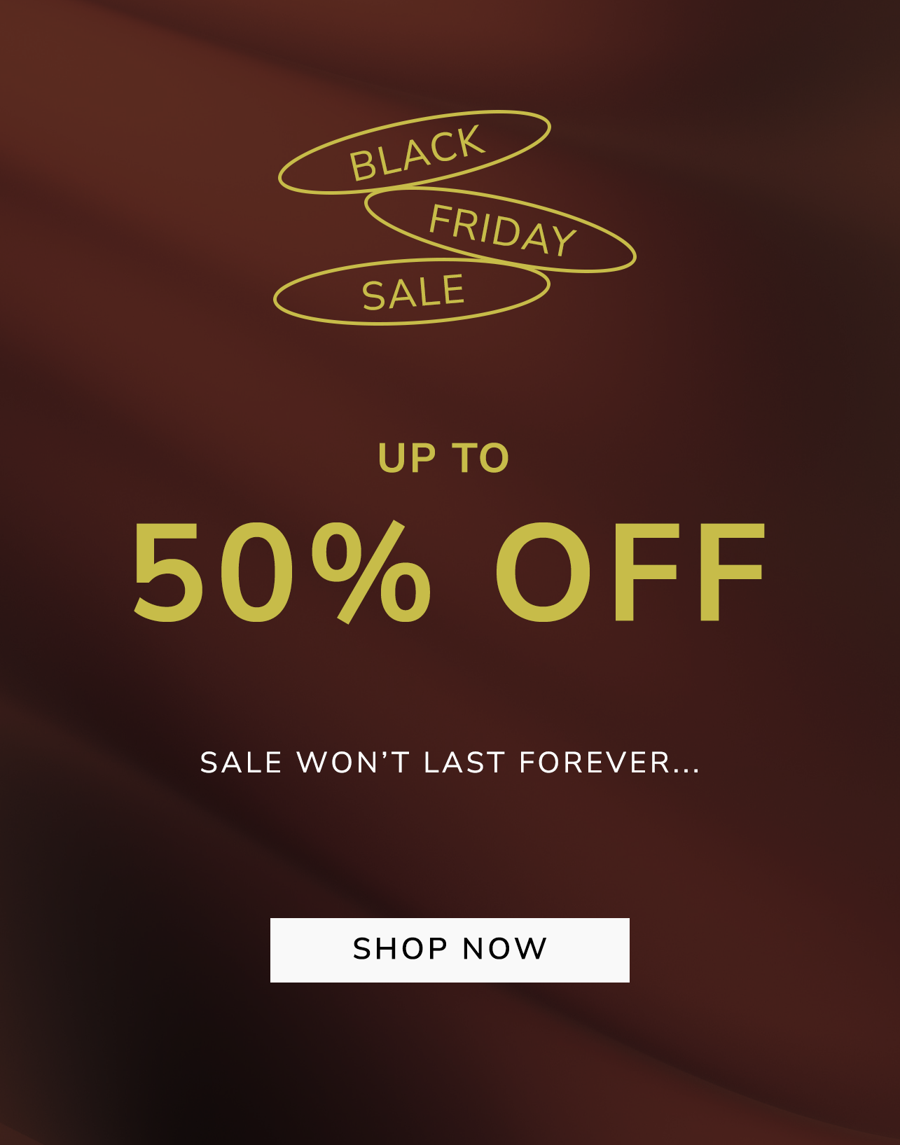
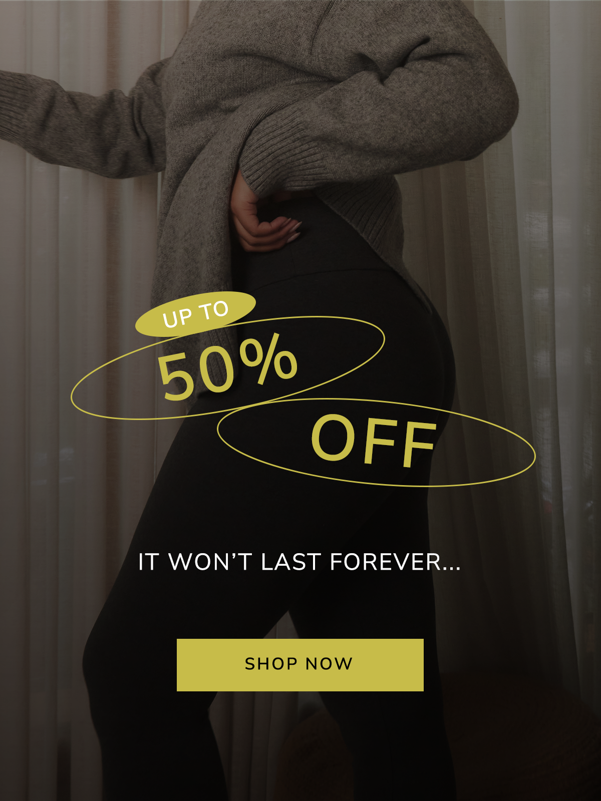
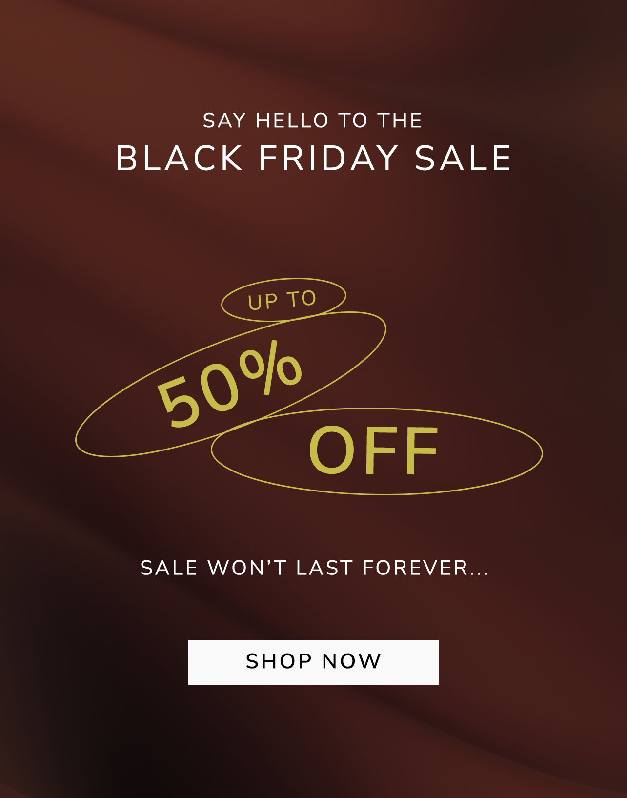
Rather than stacking the words statically, I gave each one its own container: BLACK, FRIDAY, SALE. The result is a dynamic composition that guides the eye with rhythm and bounce, creating a sense of movement that mirrors the urgency of the moment. This kind of motif is playful and slightly retro, suggesting energy and movement, perfect for a Black Friday Sale, which is all about urgency and excitement.
Even when I didn't have motion in my design, the "bouncing" feel of the ovals gave the graphic a kinetic quality.